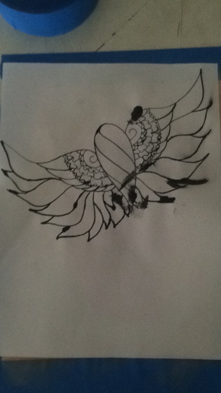
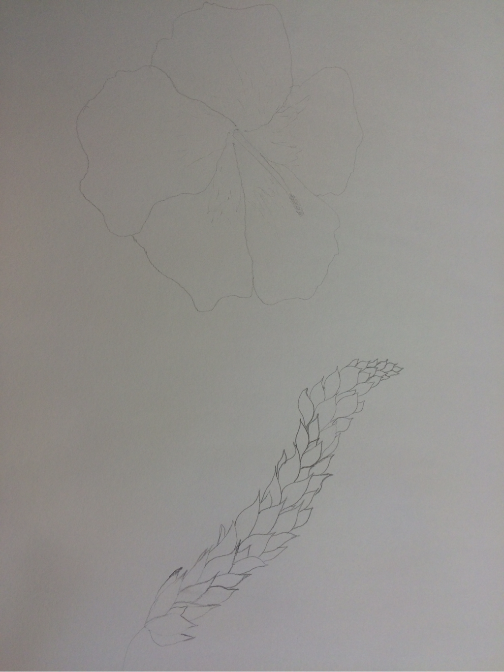
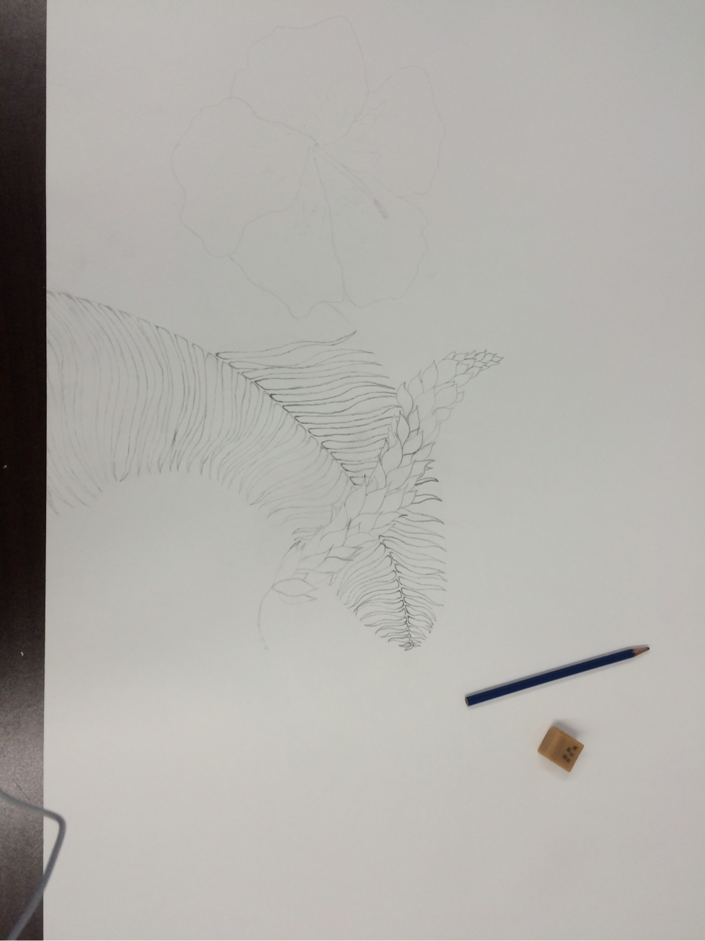
This was inspired my a tattoo I would like to get. From the henna bird I created a while back,it grew on me a lot. I want the body to be abstract. I want the wings to be more geometric then organic. I used normal printer paper. my media was india ink and a pen. This helped me to realize some of the things I like and dislike about it and what I need to change. if this is something I want to put on my body forever than it has to be perfect.
I don't have an exact image that inspired me for this image. I want to start experimenting with water color and learn how to blend and fade colors. I put a light yellow wash over the entire page. then I used a gold color to darken the edges. I also taped it down at angles. I used a purple and a pink to create the facial color. I also need to learn how to make abstract art. I haven't progressed in my concept of facial drawing and would like to learn. I NEED to learn how to create faces.
This page was inspired from the texture assignment we did last week. I used textures to not only add texture to the picture but to create all the lines. I did not make any lines on my piece with my pencil. everything is a rubbing from another surface, even the lines on the cabin. The texture on the mountains have an almost stipling look, where as the grass is a cross hatching technique from the floor panel I used to create it. I added color to the sun above the stream that comes from the base of the mountains. I used yellow and orange colored pencils and blended them to fade the color into eachother.
This is my two in one project. My two initial thumb nail pictures were half an eye and a zoomed in butterfly wing. I used colored pencils and a regular pencil for the entire piece. I left the eye in black and white to contrast with the purples and blue of the wings. It helps to keep your eye moving between the two. The dark purple spots draw your eye outward and the dark black spot of pupil draws you back.
My color scheme is split complementary. I'm going to do a large, floral painting. I am making a very tropical floral arangment. Hawaiian flowers, palms, and ferns. I am very happy with how the three pieces have come out so far my favorite is the leafy flower type strand. I can't wait to fill the page and start painting. My plan is to use one tint and one shade of every color plus white highlights. I want this piece to be very brightly colored and very vibrent and topical.
i used to wear this pair of shoes every day. I stopped about a year ago but I could never get myself to get rid of them because the still fit my feet. But I decided to memorialize them forever in an art project! I made an EXACT replica. Every price is measured from heel to toe! Even the logo is the same size. I used willow charcoal for the top and bottom background to create not only a background but to simulate a platform for the shoe to be placed on. The color in the shoe is colored pencils. Every stitch is in pencil.
Satisfying Views. My theme for this project. Mountains have always fascinated me. I plan to continue working on this project. I think it has great potential. I really like what has come of it so far. I love the contracts. It takes me back to my trip across Europe this summer. The amazing landscapes, and views that are around the world that some people only will ever get to see in pictures.
Theme for this piece is fantasy. I once again used one major focal point to draw attention. The trees on the side make yours eyes follow upward and when you run out of space it brings yours eyes from the red at the top to the blue at the bottom and back to the small fairy creature. I made it more unrealistic by just giving her an orange ball of light for a head. I've done wierd things to pre-existing fairy tail creatures before, like giving mermaids fins instead of arms. Just to make it more interesting than the average. That's another reason I only painted one. So people focus on it and notice the difference in mine from all the rest. This way it's not "just another". Leaving everything simple and one detailed point is so interesting the way you can force people to pay attention to whatever you want. Make them see what you want them to see!
My theme was WINTER. Winter is by far not my favorite season. I'm always, without fail, sick! So with my unfondness of winter in mind, I started with beautiful blue snow flakes, the same way winter starts. Then I did a light grey wash over most of the piece. Then I gradually added more black as I got to the bottom of the piec. The black which represents my dislike of winter, covers up the pretty little flakes. They are still there, just in the back.
|
Archives
March 2016
Categories |